ROCKET LEAGUE - PSYONIX/EPIC GAMES
Winner or nominee of more than 150 “Game of the Year” awards, Rocket League is one of the most critically acclaimed sports games of all time, and boasts a community of more than 60 million players! In 2019, Psyonix became part of the Epic Games family, creators of Fortnite and the Unreal Engine.
ROLE
UX Designer
UI Artist
Product Designer
TIMELINE
2016-2020
PLATFORMS
PC
PlayStation 4
PlayStation 5
Xbox One
Xbox One S
Xbox Series X|S
Nintendo Switch
TOOLS
Photoshop
Illustrator
Scaleform
Unreal Engine 3
Marvel App
Adobe XD
I joined the Rocket League UI team in 2016 as a UI Artist and Designer. Over the next four years, I worked closely with fellow UI Artists, UX Designers, studio leadership, engineers, external contractors, and third-party vendors to take my UX wireframes from concept to fully implemented UI for all new features and updates.
RANK ICON REDESIGN (2016)
My first task at the studio was to redesign the progression medals for the Rocket League ranked mode.
THE PROBLEM
The previous design for Rocket League rank icons was a more nebulous, harder to follow system that had rank icons such as “Rising Star,” “Superstar,” “Challenger,” and “Prospect.” The original rank progression icons are below.
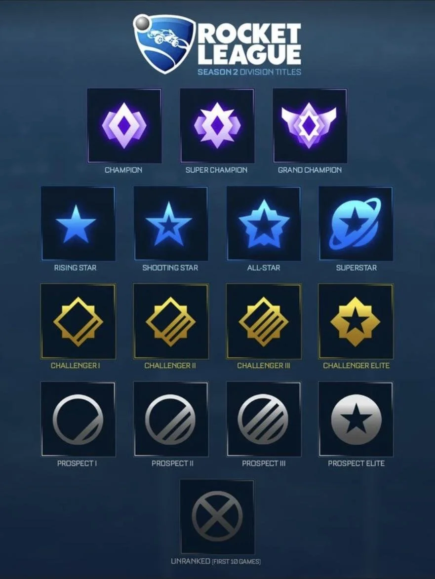
THE SOLUTION
I was tasked with redesigning the art style and additional ranks to follow a more traditional gold > silver > bronze progression and some added tiers beyond that. This design needed to follow the current "arcadey" art style look and feel that was already established in Rocket League. I was responsible for the UI Art for this feature.

One of my first tasks at Psyonix was to redesign the new Rank Icons.
FREE-TO-PLAY, ROCKET PASS, AND SHOP UPDATE (2019-2020)
As Rocket League moved from a $20 premium game to a free-to-play model, I played a core role in updating the game’s UI to support new engagement and monetization systems. I designed UX flows and UI art for the Rocket Pass, the Item Shop, and the overall F2P UI refresh. This work helped Psyonix introduce a shop-driven economy, a $10 Rocket Pass with unlimited-track rewards, and a modernized interface capable of supporting ongoing seasonal updates and live-service features.
THE PROBLEM
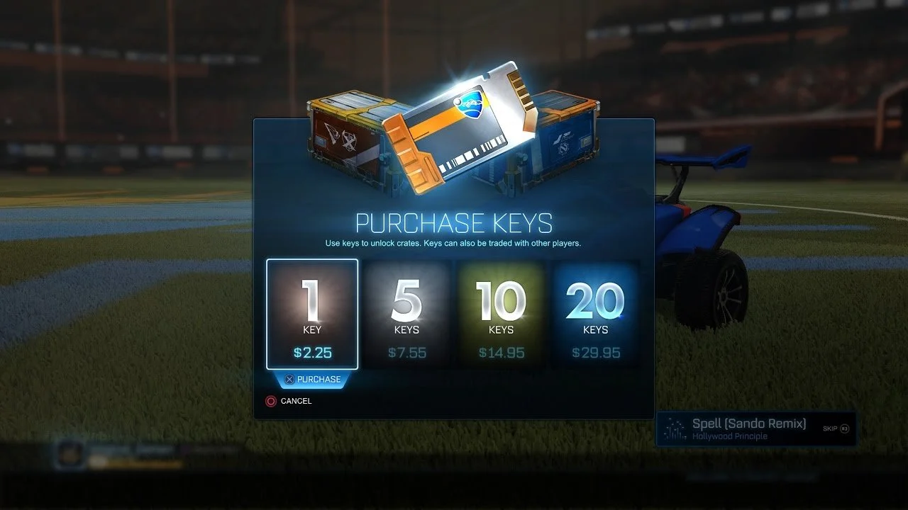
The feature for crates were special item drops that contained exclusive Bodies, Decals, Goal Explosions, Rocket Boosts, Trails, and Wheels. They were introduced on September 8, 2016.
Each crate had a unique "series" of items ranging from Rare, Very Rare, Import, Exotic, and Black Market rarities. Players could unlock crates with keys, which were available for sale in the "Manage Inventory" and "Crate Unlock" menus. Alternatively crates could've also been opened using decryptors. Unlocking a crate revealed a random exclusive item. There would be a chance of acquiring a certified or painted variant of each item.
THE SOLUTION
The solution was Rocket Pass. This is a brand new, time-limited progression system that will gives players several ways to earn new content in Rocket League. The goal is to offer several Rocket Passes every year, with an emphasis on new, unique content for each Pass. The Rocket Pass was designed to take place of the very popular Crates and Keys feature that was needed to be removed from the game due to new legislation that may cause potential legal issues and the perception of gambling.
I designed the layout, interaction, upgrade modals, new icons (including the Free and Premium Rocket Pass shields) and more.
For this project, I worked with the lead designer, Corey Davis, on what the overall goal for this feature would be and I was responsible for the UX and UI Art for the entire feature.


After trying various progression path layouts, I also needed to explore options on how to quickly preview new items on Car Bodies while also accounting for the users current Rocket Pass tier, the upsell for Premium if users were only a Free member, and the selected state for what item/tier the user is previewing. This one was awkward visually, didn’t show the progression path clearly, and the preview wasn’t conducive to multiple types of items. This version did not work.

Another quick layout option I explored was a vertical “ladder” system. Viewing item icons wasn’t ideal nor was it helpful in previewing them on the car body. This exploration was primarily to help the stakeholders on this feature quickly see this was something they DID NOT want. Needless to say we did not go with this version.
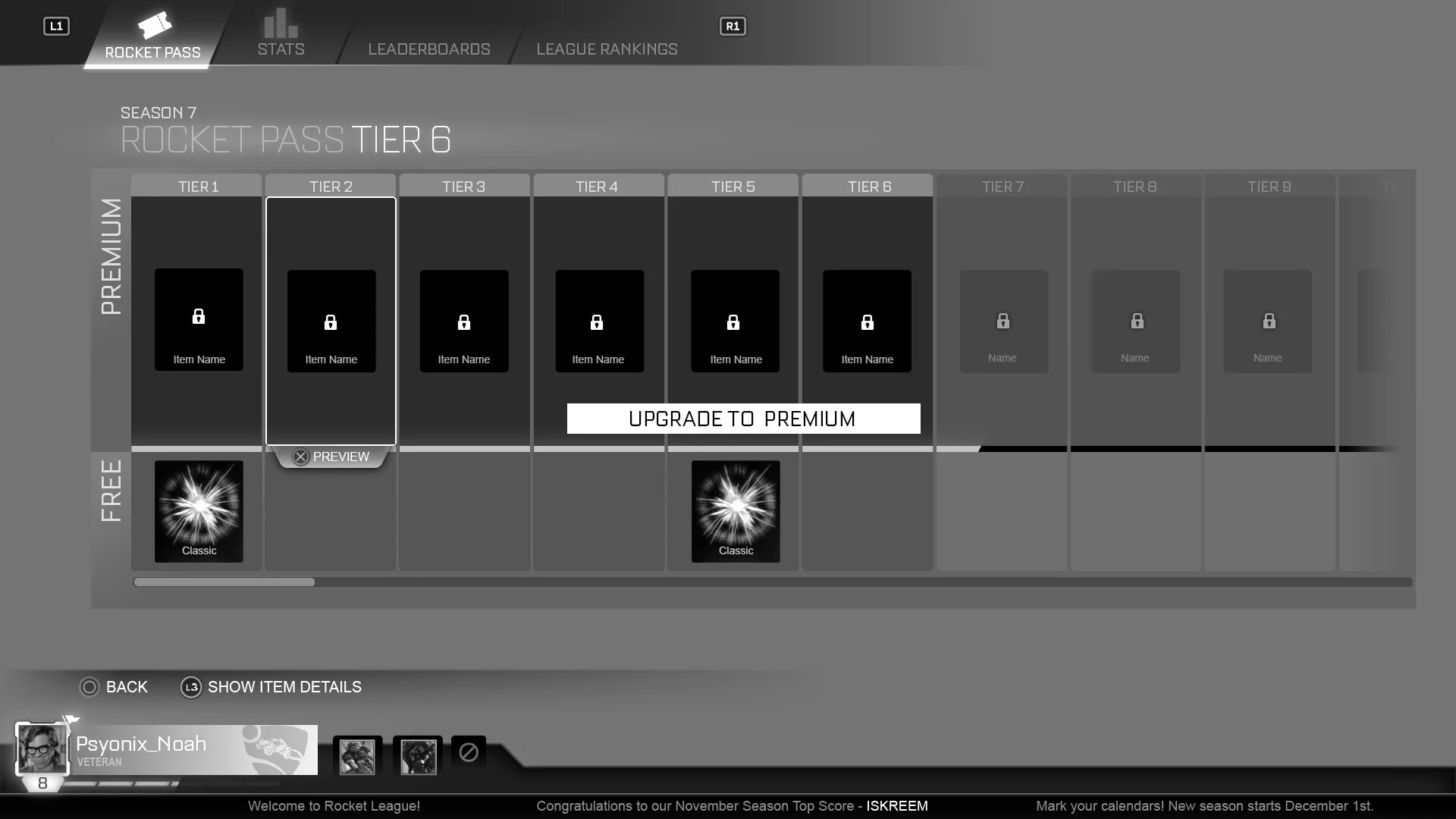
I explored several different progression paths for layouts. In the end, I landed on Premium on top and the Free path below. I also explored the option for possible multiple items in some Premium Tiers, hence the more negative space in the Premium progression track.

ROCKET PASS UI ART AND POLISH
After testing the UX wireframes and various iterations on MarvelApp (before we used Adobe XD or Figma for internal interactive mockups) I started the UI Art and Polish for implementation. During this process we found more possible issues that needed attention. One part of the difficulty of designing this feature was that a leveling system in Rocket League already existed. The goal was to remove confusion for players that would now see two levels: their account level and their Rocket Pass tier. I initially designed Rocket Pass with a leveling system that was tied to their current account level XP. We discovered that this would create confusion because some users would be halfway to level XX but starting at Rocket Pass Premium Tier 1.

Previous UX mockup versions of the challenge system and possible progressions and rewards are below.

Early variations had a progression system that players could preview what item they’d be unlocking next on the Rocket Pass.


The solution the design team landed on was a “pip” progression. Users would now tier up their Rocket Pass by earning pips post-round and extra pips through simple, fun challenges. If players were Premium Pass members, they would earn even more options on tiering up their Rocket Pass. So now my responsibility on this new part of the feature was to show multiple challenges, what level of completion you were on for those challenges, what week of the challenges you were on (the Challenge Roadmap), your current Rocket Pass tier, how to navigate back to the main Rocket Pass page, and how to Tier Up or purchase Premium, all on one page.

The final Rocket Pass UI that is now in-game.
After multiple layout explorations, progression path preview needs, and now adding a tab navigation for the new Rocket Pass Challenges, I landed on a two-tiered horizontal progression path below the live in-game rendering of Car Body showing a preview of the selected item. This flexibility allowed simple navigation to preview any items in 70+ Tiers, an accessible way to upgrade on any screen, and an easy way to see where you as a player are on the Rocket Pass at any time. This feature has done very well for Psyonix as a company and has been proven as an engaging feature for Rocket League players.
(BY 2020 LAUNCH)
(BY FEB 2021)
The shift to a Free-to-Play (F2P) model, combined with the structured seasonal content of the Rocket Pass, fundamentally transformed Rocket League's business and growth trajectory.
This strategy removed the initial cost barrier, rapidly expanding the user base by 100% (to ~95M MAU) and pushing peak concurrent players past the 1 million mark. By shifting monetization entirely to cosmetic microtransactions and engaging seasonal updates, the game sustained high player retention and established a successful and sustainable business model.
The success of Rocket League also led to the attention (and eventual acquisition) of Psyonix by Epic Games for an undisclosed, multi-million dollar deal.
SHOP (2019-2020)
I designed the new Shop layout and interaction after we removed the Crate & Key loot drop system.
Single Featured Item

Two Featured Items alternate layout.
The item preview for a non-licensed (Psyonix created) car body that also needed to show all included items with the purchase.

This is an item preview mockup for when Psyonix would sell licensed items that also needed to account for legal text, logos, and no customizable items.
BEST OF HUD
Psyonix wanted to add their own challenge system and I was tasked with designing new HUD changes as well as Pre and Post Round notifications. The design was for adding a “Best of 5” gametype and how that would be presented to the players without completely changing the existing HUD too much. I added a notification under the clock and simple pips for progression. I also created the post-round and pre-game screens that were simple pop up notifications.

Changes to the HUD included the pip progression to represent wins and which game the players were on.

Pre-game notification. The information needed was which tournament, which game, and the map players were playing.

Post round status and wins.
INVENTORY TRADE UP
The longer players played Rocket League, the more items they’d accrue in their inventory and much of them would be duplicates or items they don’t care about.


CONNECTION QUALITY UI
We needed additional connection quality indicators for players that needed more information to better represent the connection issues they were having instead of the singular “Triangle of Death.” the new connection indicators I created are below.