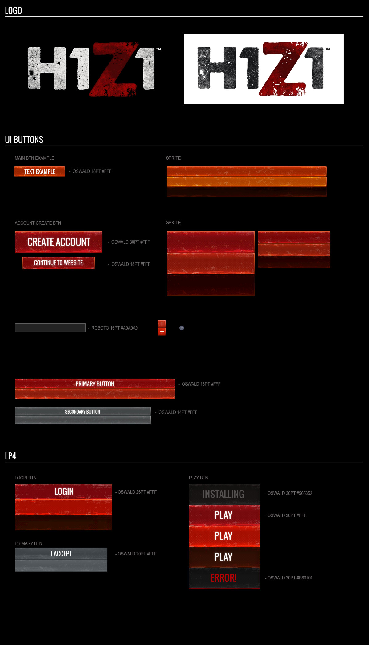
I worked with the Art Director to establish the consistency of the UI Art and while also working on the UX for H1Z1.
H1Z1 is an open world survival PC game currently out on Steam Early Access. It's currently also planned to come to the PlayStation 4 and Xbox One.
I started as the Lead Web Designer on H1Z1.com and shortly after moved over to create the UI for Daybreak's new game. I wanted to create a user interface that was not only easy to navigate but would fit with the color scheme and textured feel for a post apocalyptic world.
I started with the style that I had already laid out for the current site and used that as a foundation for my design. I wanted the look and feel going from the web presence to the Launcher and then to the game to look and feel as consistent as possible.
From here I created some basic wireframes. The UI needs to support a lot of complex navigation and abilities for the player to use so I decided to take out the "hidden" ability tabs for Inventory, Crafting, and Discovery and move them to the top and make them much larger.
After wireframing this out I felt like there was still a disconnect from the selected tab and the information it was displaying. From here I went on to create a connected frame around the tab itself connecting to the information below it. The current wireframes are a work in progress.


My task was switched to the Main Menu and loading screen. The previous loading screen before we went to Early Access launch was just a screenshot of the city with a dark version of the logo. I re-cut the Key Art, tweaked a few art elements and added our logo to keep it simple.
The Main Menu had to display a lot of information ranging from News, Server status, Friends lists that were being pulled in from Steam, Launching H1Z1 from servers, changing your character, Playing Battle Royale, etc. It also needed to display your Inventory and items from special crate unlocks.
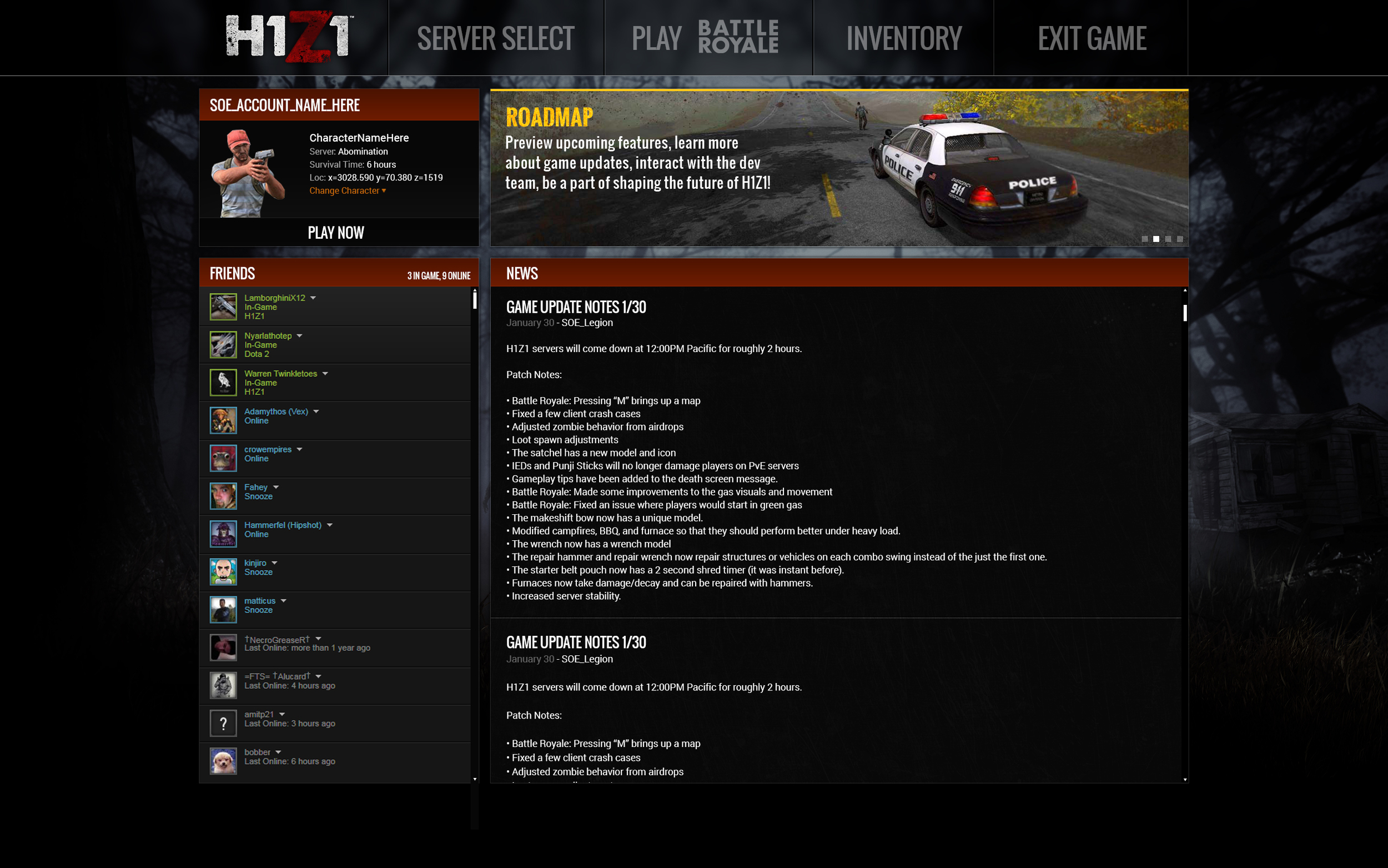
I gave the game Art Director a few options as far as navigation went. My initial idea was to keep it simple and have a top navigation much like the current website.
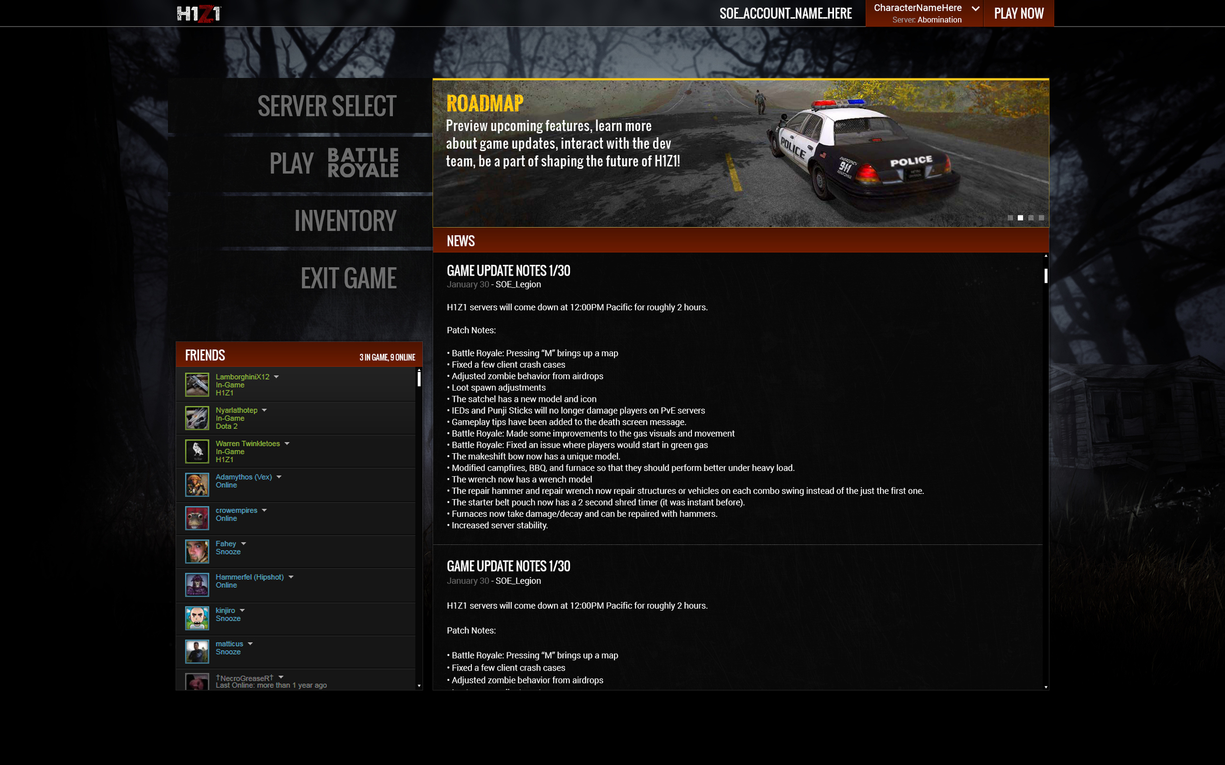
First version
Second version with a larger navigation along the top. I also added a Paper doll with your status, last in-game location, and a Quick Play option.
I finally submitted a revision that we settled on with a side navigation, larger text and logo and the Login, Character info and Quick Play option at the top.


